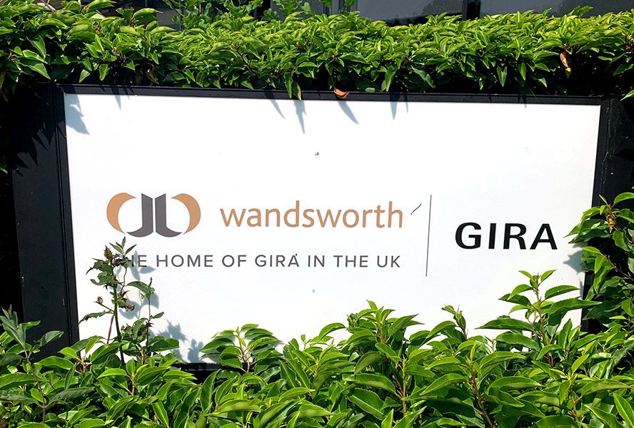
Gira UK contact

Get in contact with Gira UK c/o Wandsworth,
the home of Gira in the UK.
Wandsworth, the home of Gira in the UK
Ritchie House
Woking Business Park
Albert Drive
Sheerwater, Woking, GU21 5JY
Phone: +44 (0) 1483 713400
sales@gira.com
wandsworthelectrical.com

Gira UK Distributors
Ivory Egg (UK) Ltd. Smart home suppliers & support
11 St Peters Gate
Nottingham
NG1 2JF
Tel +44 (0) 3333 079 100
www.ivoryegg.co.uk
info@ivoryegg.co.uk
My KNX Store
Unit 2A, Poplar Court, Atley Way,
Nelson Park Industrial Estate,
Cramlington, NE23 1WR
United Kingdom
Tel +44 (0) 191 4970777
Contact Overview
Gira and Wandsworth – a powerful duo.
When it comes to switches and smart buildings, the two premium brands Gira and Wandsworth are a powerful duo in the United Kingdom. Since their merger in January 2022, the Wandsworth Group has been the new home of Gira in Great Britain and Northern Ireland. As well as sharing a history spanning almost 120 years, the two brands are united by their innovative strength, their exceptional quality and design standards, and their outstanding customer service. At the same time, Gira and Wandsworth bring mutually different strengths and competencies to the partnership. On the one hand, Gira stands for innovative building technology that is “Made in Germany”. On the other hand Wandsworth Electrical is renowned for its excellent machining and refined finishing of metals – tailored to customer-specific requirements and in designs that embody Britishness in its purest form.
About Wandsworth Electrical.
Wandsworth Electrical is renowned for its excellent machining and refined finishing of metals – tailored to customer-specific requirements and in designs that embody Britishness in its purest form. Constant optimisation of processes ensures that Wandsworth products offer British quality and stand the test of time. The range encompasses a total of 23 different finishes, including various versions of gold, silver, nickel, bronze, copper and brass. The surfaces are always finished by hand to ensure the premium quality required.
Wandsworth design lines are mainly used in high-end projects, from luxury residential complexes such as the converted Battersea Power Station in London and upmarket hotels such as the NoMad in London to renowned buildings forming part of the UK’s cultural heritage.
Representatives worldwide
"Future -fit technology and flexible solutions combined with high quality of design: that's what smart smart building installations systems by Gira stand for. With more than 1,200 employees and representatives in 40 countries, Gira is among Germany's leading mid-sized electrical companies. Find our professional partner in your country here.
